中国和美国现在的实力越来越接近,也许在未来会发生很多微妙的事情。对于这个实际而言,有两个实力接近的国家历来不是什么好事。
library(WDI)
library(tidyverse)
## ── Attaching core tidyverse packages ──────────────────────── tidyverse 2.0.0 ──
## ✔ dplyr     1.1.4     ✔ readr     2.1.5
## ✔ forcats   1.0.0     ✔ stringr   1.5.1
## ✔ ggplot2   3.5.2     ✔ tibble    3.2.1
## ✔ lubridate 1.9.4     ✔ tidyr     1.3.1
## ✔ purrr     1.0.4
## ── Conflicts ────────────────────────────────────────── tidyverse_conflicts() ──
## ✖ dplyr::filter() masks stats::filter()
## ✖ dplyr::lag()    masks stats::lag()
## ℹ Use the conflicted package (<http://conflicted.r-lib.org/>) to force all conflicts to become errors
library(plotly)
##
## 载入程序包:'plotly'
##
## The following object is masked from 'package:ggplot2':
##
##     last_plot
##
## The following object is masked from 'package:stats':
##
##     filter
##
## The following object is masked from 'package:graphics':
##
##     layout
library(dplyr)
library(ggplot2)
# 获取GDP数据(当前美元价)
gdp_data <- WDI(
country = c("CN", "US"),
indicator = c("NY.GDP.MKTP.CD", "NY.GDP.PCAP.CD"), # GDP总量与人均GDP
start = 1978,
end = 2010
) %>%
rename(gdp = NY.GDP.MKTP.CD, gdp_per_cap = NY.GDP.PCAP.CD) %>%
mutate(country = case_when(
iso2c == "CN" ~ "中国",
iso2c == "US" ~ "美国"
))
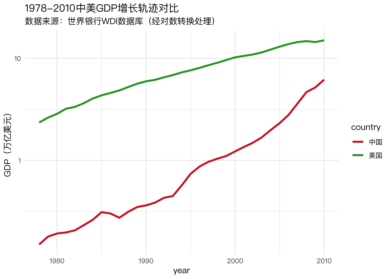
p1 <- ggplot(gdp_data, aes(x=year, y=gdp/1e12, color=country)) +
geom_line(linewidth=1.2) +
scale_y_log10(
"GDP(万亿美元)",
breaks = c(0.1, 1, 10),
labels = c("0.1", "1", "10")
) +
scale_color_manual(values=c("#D62728", "#2CA02C")) +
labs(title="1978-2010中美GDP增长轨迹对比",
subtitle="数据来源:世界银行WDI数据库(经对数转换处理)") +
theme_minimal(base_family="PingFang SC")
p1
# 保存为pdf文件
# ggsave("Sino-US_gdp.pdf", device=cairo_pdf, width=14, height=9, dpi=300)
# 转化为交互图形
# ggplotly(p1)
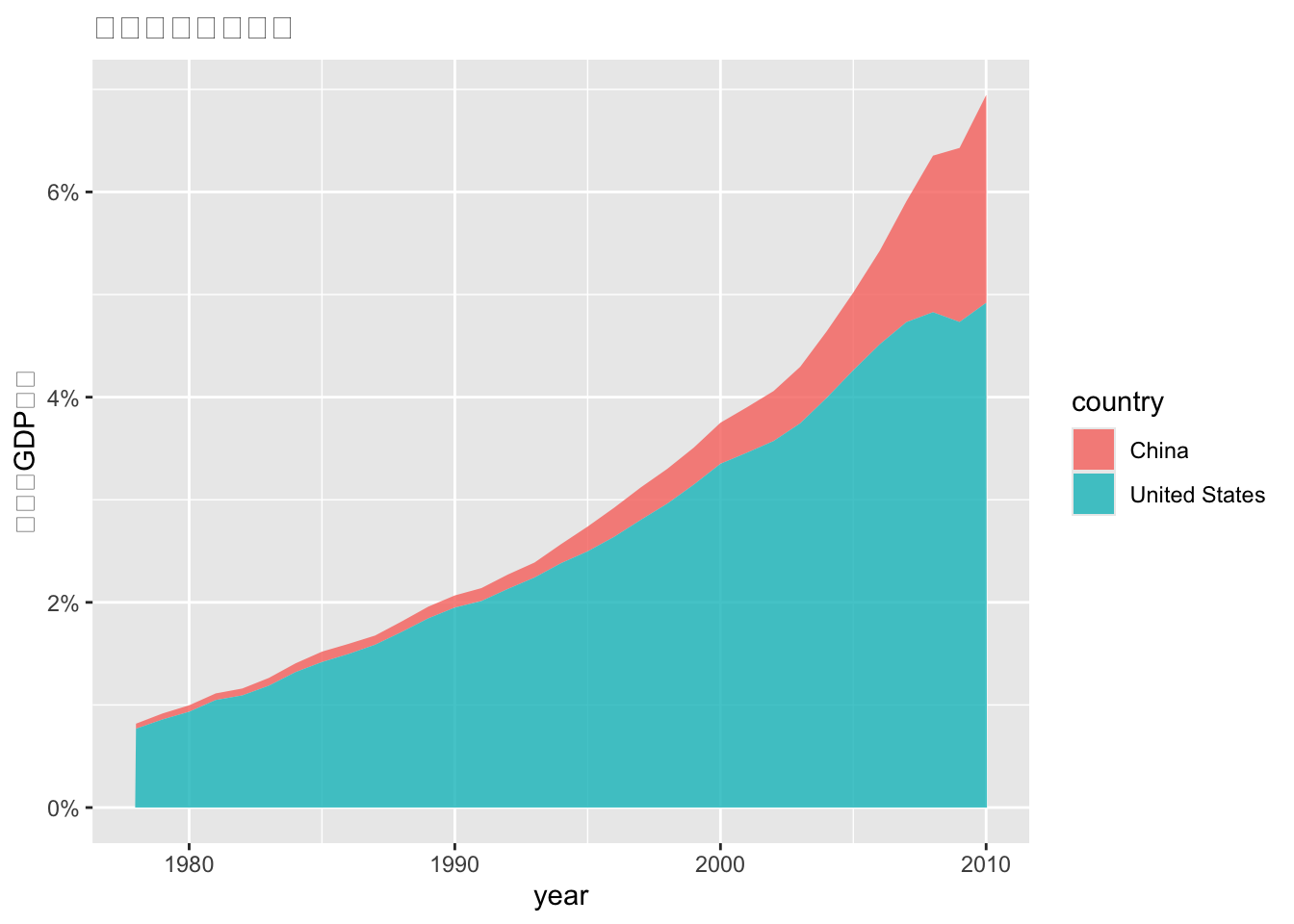
gdp_data <- WDI(
country = c("CN", "US"),
indicator = c("NY.GDP.MKTP.CD", "NY.GDP.PCAP.CD"),
start = 1978,
end = 2010
) %>%
rename(gdp = NY.GDP.MKTP.CD, gdp_per_cap = NY.GDP.PCAP.CD) %>%
mutate(global_share = gdp / sum(gdp)) %>%
group_by(year)
p2 <- ggplot(gdp_data, aes(x=year, y=global_share, fill=country)) +
geom_area(alpha=0.8) +
scale_y_continuous(labels=scales::percent) +
labs(y="占全球GDP比重", title="全球经济格局演变")
p2
  # 保存为pdf文件
  # ggsave("Sino-US_Comparison.pdf", device=cairo_pdf, width=14, height=9, dpi=300)
  # 转化为交互图表
  # ggplotly(p2)