引言
俗话说,巧妇难为无米之炊。绘图的前提是得有数据在手。下面是获取数据的代码:
# 定义股票代码
tickers <- c("TSLA", "AAPL", "NVDA")

# 批量下载股票数据并进行预处理
stock_list <- map(tickers, function(ticker) {
  # 下载数据
  stock_data <- getSymbols(ticker, auto.assign = FALSE)
  # 重命名列
  colnames(stock_data) <- c("Open", "High", "Low", "Close", "Volume", "Adjusted")
  # 转化为tibble
  tibble_data <- as_tibble(fortify.zoo(stock_data))
  # 标准化列命名
  renamed_data <- tibble_data %>%
    rename(
      Date = Index,
      open = Open,
      high = High,
      low = Low,
      close = Close,
      volume = Volume,
      adjusted = Adjusted
    )
  # 动态命名
  dyn_name <- paste0(ticker, "_data")
  assign(dyn_name, renamed_data, envir = globalenv())
  return(get(dyn_name))
})
# 重新命名列表
names(stock_list) <- tickers
有了基础数据之后,接下来是根据布林带定义计算布林带值,并将布林带数据整合进原始数据备用。
# 使用dplyr生成包含high, low, close的tibble对象并计算布林带
stock_list_with_bbands <- map(stock_list, function(data) {
  # 确认输入参数为tibble对象
  if (is.list(data) && length(data) == 1) {
    data <- data[[1]]
  }
  # 提取eTTR::BBands所需参数
  hlc_tibble <- data %>% select(high, low, close)
  # 计算布林带
  bbands <- BBands(hlc_tibble, n = 20, sd = 2)
  # 整合进原始数据
  data %>%
    mutate(
      middle = bbands[, "mavg"],
      upper = bbands[, "up"],
      lower = bbands[, "dn"]
    )
})

# 将列表中的tibble行合并,并增加公司名作为列
combined_data <- bind_rows(stock_list_with_bbands,.id = "company_name")

# 确保相关列是数值型
num_cols <- c("open", "high", "low", "close", "middle", "upper", "lower")
combined_data <- combined_data %>%
mutate(across(all_of(num_cols), as.numeric))数据准备好之后,用ggplot2包几行命令就可以打造一个叠加布林带的蜡烛图,代码如下:
# 利用分面功能绘制多支股票的蜡烛图和布林带
ggplot(combined_data, aes(x = Date)) +
  geom_candlestick(aes(open = open, high = high, low = low, close = close)) +
  geom_line(aes(y = middle), color = "blue") +
  geom_line(aes(y = upper), color = "red") +
  geom_line(aes(y = lower), color = "green") +
  facet_wrap(~ company_name, scales = "free_y") +
  labs(title = "多股票布林带对比", x = "日期", y = "价格") +
  theme_minimal()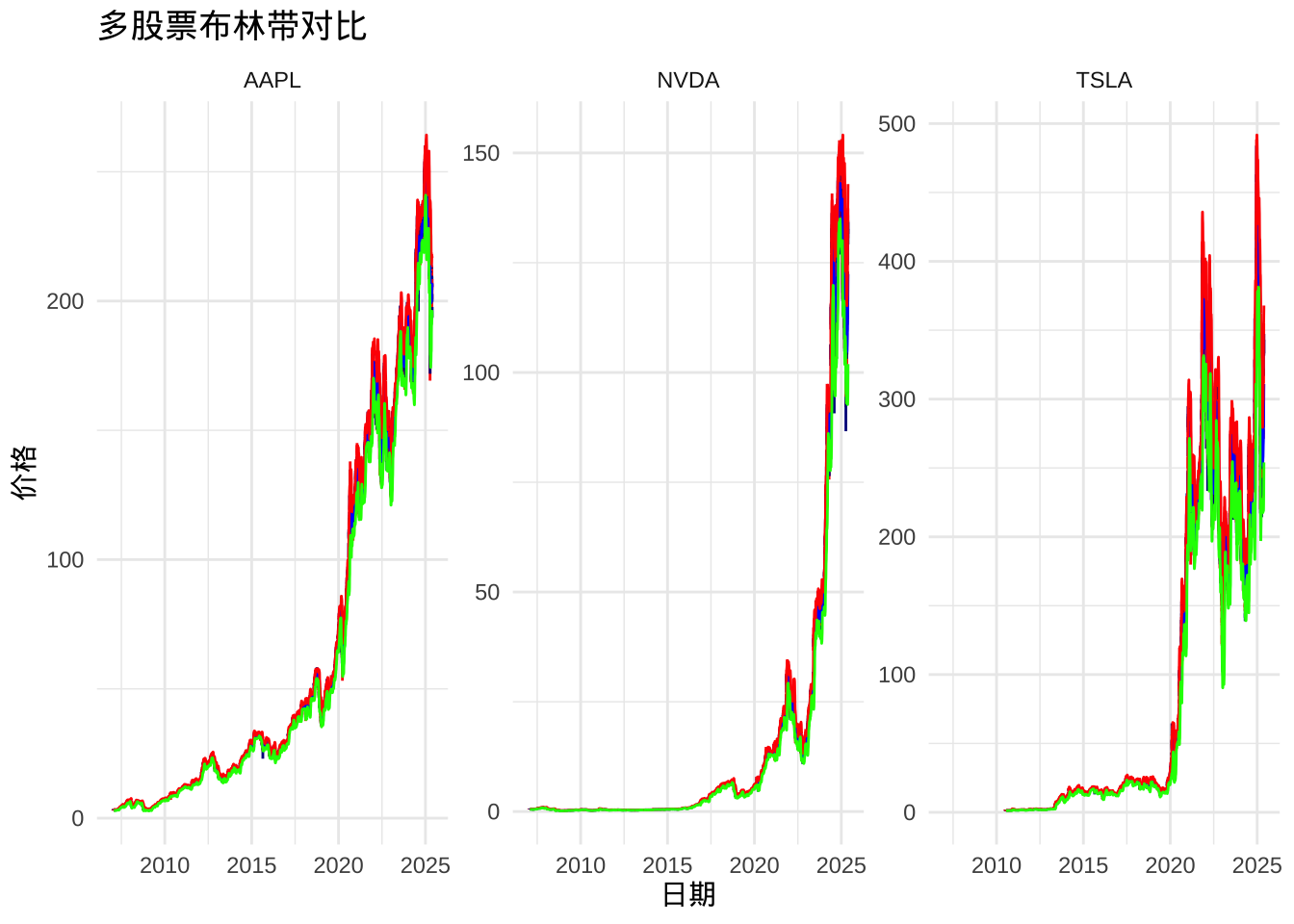
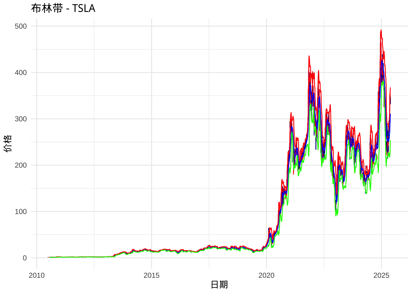
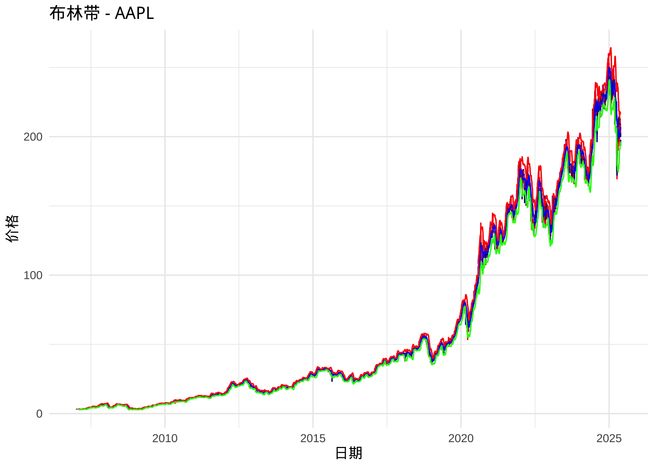
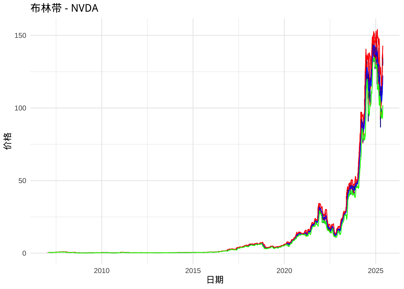
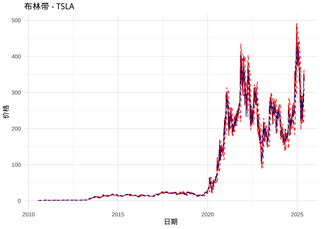
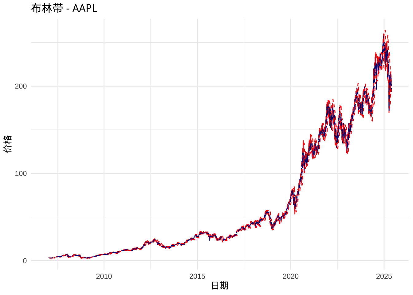
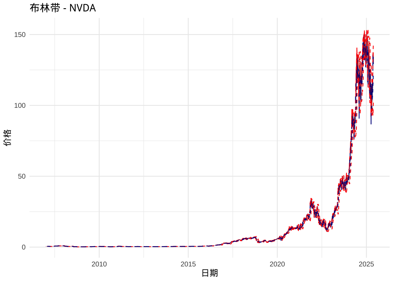
当然,还可以单独绘制每支股票的蜡烛图叠加布林带。这里我们使用purrr包中的walk2函数来遍历列表中每一个对象。代码如下:
# 单独绘制每支股票的蜡烛图叠加布林带
walk2(stock_list_with_bbands, names(stock_list_with_bbands), function(data, name) {
   if (is.list(data) && length(data) == 1) {
    data <- data[[1]]
   }
  p <- ggplot(data, aes(x = Date)) +
    geom_candlestick(aes(open = open, high = high, low = low, close = close)) +
    geom_line(aes(y = middle), color = "blue") +
    geom_line(aes(y = upper), color = "red") +
    geom_line(aes(y = lower), color = "green") +
    labs(title = paste0("布林带 - ", name), x = "日期", y = "价格") +
    theme_minimal()
  print(p)
})
其实,tidyquant包中提供了一个直接绘制布林带的函数叫 tidyquant::geom_bbands,可以在绘图时直接基于HLC数据计算布林带。这样一来,可以免去单独计算布林带数据的过程。
# 基于geom_bbands 单独绘制每个对象的蜡烛图叠加布林带
walk2(stock_list, names(stock_list), function(data, name) {
   if (is.list(data) && length(data) == 1) {
    data <- data[[1]]
   }
  p <- ggplot(data, aes(x = Date)) +
    geom_candlestick(aes(open = open, high = high, low = low, close = close)) +
    geom_bbands(aes(high = high, low = low, close = close),ma_fun = SMA, n = 20) +
    labs(title = paste0("布林带 - ", name), x = "日期", y = "价格") +
    theme_minimal()
  print(p)
})
呐,有了R语言,尤其是eTTR包和ggplot2包之后,计算技术指标并进行可视化就是这么简单。欢迎收藏本网站,关注微信公众号ruijiao007。